Behavioral Health AR Dashboard
See what is open, what paid, and what is likely to land next.
Month-end shouldn't begin with rebuilding the claims picture.
The PayerLenz AR Dashboard shows open and closed claims, billed versus allowed versus paid amounts, trailing performance, and projected payment timing based on your own claims history.
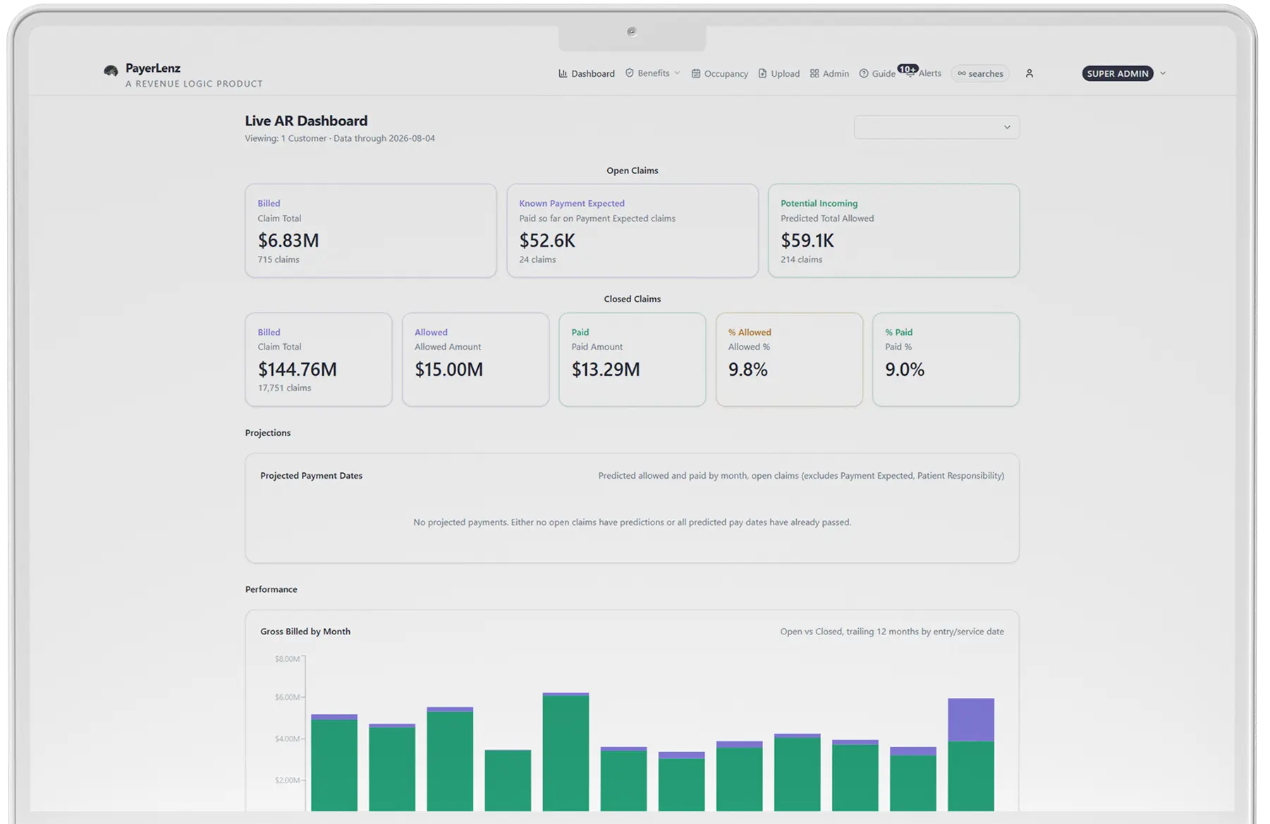
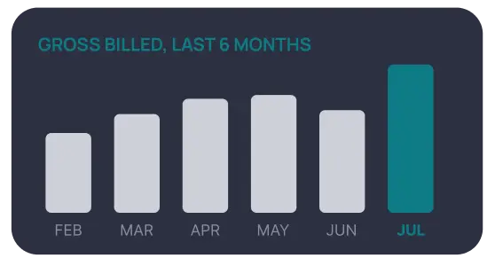
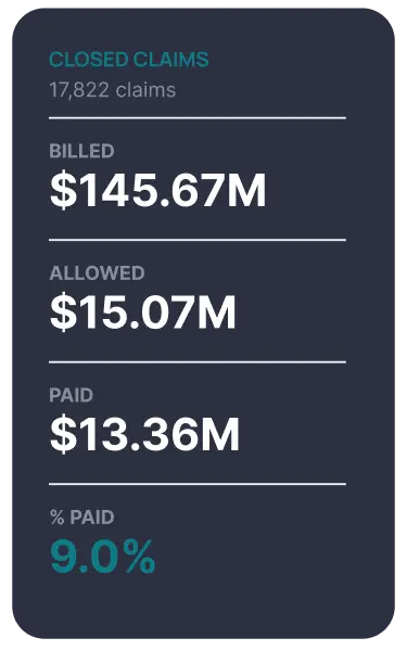
The AR dashboard: what is open, what was allowed, and what is likely to land.
One View
The operating numbers, in one view
Open and closed claims
Separate work still in AR from claims that have reached a closed status. See the underlying dollars, not just a claim count.
Allowed and paid percentages
Monitor allowed and paid performance at a glance. A shift to a payer, reimbursement, or collections issue that deserves claim-level review.
Trailing performance
Put the current month in context. Review whether movement is a one-month variance or part of a longer pattern.
Billed, allowed, and paid
Compare the three amounts directly:
- Billed: what your organization charged
- Allowed: what the payer recognized under its adjudication
- Paid: what the payer issued, subject to the claim and patient responsibility
The gap between each stage tells a different story. Keeping the stages separate helps the team look in the right place.
Projected payment timing
Estimate when open claims may pay based on your organization's own payment history, payer by payer, using the speed-to-pay patterns observed in your actual remittances. Where your own history is thin on a payer, the projection falls back to de-identified patterns from the broader pool, and tells you which basis it used.
Reading The Dashboard
From dashboard signal to billing question
| What you see | What to investigate |
|---|---|
| Billed amounts are steady; allowed percentage falls | Payer pricing, coding, level-of-care, or methodology changes |
| Allowed amounts hold; paid percentage falls | Patient responsibility, offsets, underpayments, or unresolved claim activity |
| Open claims rise while volume is stable | Submission, adjudication, follow-up, or payer-cycle delays |
| Projected payments move into later months | Changes in your observed payment timing by payer |
| One month drops but trailing performance holds | Timing variance rather than an established trend |
The dashboard points the team to the question. It doesn't replace claim-level follow-up or accounting reconciliation.
Not A Blended Average
Your history, not someone else's average
Projected timing is built from your claims history. That matters because two facilities can treat similar patients and still have different payer mixes, submission patterns, and adjudication timelines.
PayerLenz uses your observed data to make the dashboard relevant to your operation. Benchmark pool data remains separate from patient-identifiable claim views and supports aggregate reimbursement analysis.
Get 15 Free SearchesOne Line
One line from intake to payment
PayerLenz connects rate expectations at admission with actual claim performance later:
Run Real-Time Eligibility
Review the Reimbursement Benchmark
Order a Live VOB when the plan needs a call
Compare billed, allowed, and paid in the dashboard
That gives admissions and billing a common record: what was known, what was expected, and what the claim ultimately did.
What does a behavioral health AR dashboard show? +
Open and closed claims with billed, allowed and paid amounts, allowed and paid percentages by payer, trailing performance trends, and projected payment timing. It is one view from intake through payment rather than a month-end reconstruction assembled from scratch.
Why separate billed, allowed and paid instead of just billed and paid? +
Because the middle term is where the diagnosis lives. Billed is what you charged, allowed is what the payer recognised under its adjudication, and paid is what it issued. A falling allowed percentage and a falling paid percentage are different failures with different owners, and collapsing the two hides which one you have.
Where does projected payment timing come from? +
From your own claims history and remittance pattern, not a generic industry curve. That makes it specific to how your payers actually behave with you. It is a projection for planning, not a commitment about when any payer will pay.
Can I compare what we expected at intake against what we were actually paid? +
Yes, and that comparison is the point of recording an expectation in the first place. An estimate nobody checks against the remittance is a habit rather than a forecast.